1. Vary the scale of the patterns. This helps patterns to fit together and not compete against each other. Instead, they will compliment and let each pattern have a portion of the spot light.
 |
| In this setting, we used a large scale pattern on the French pleated drapery, a medium scale pattern on the carved wood chair upholstery, and a small scale pattern, more of a textured solid fabric, for the accent pillow. This demonstrates well how fabrics with such different patterns can compliment one another and let each shine in their own respect. |
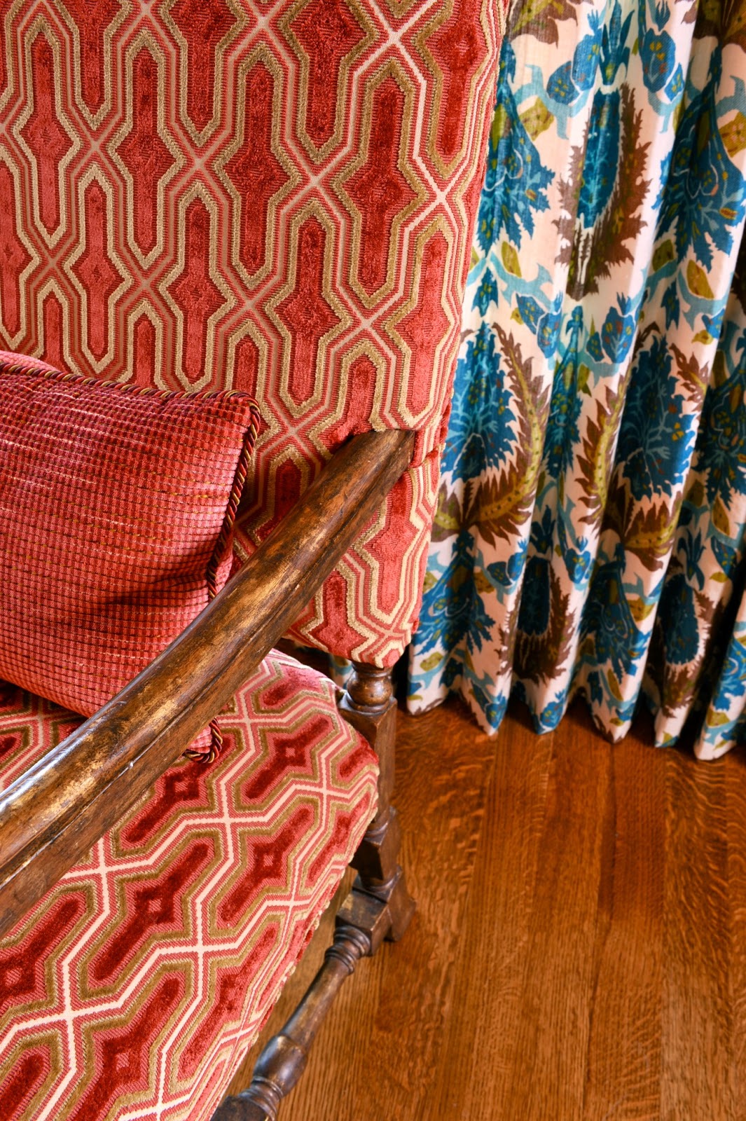 |
| Here is a close up of these patterns. Note that the different textures of the fabrics also help to distinguish them from one another. |
2. Do not use too many colors or the combination of patterns will not look unified. To create interest with color, add accents like our lime green and robins egg blue, but make sure that the majority of the pattern mixing is done in your main color. Always create a way to connect colors you add back to main color. (Notice the green branch vase with orange flowers which ties lime green pillows back to orange color scheme.)
 |
| In this Master Suite, we kept all patterns in this corner in the same color range, from a golden-rod yellow on the walls to varying shades of orange on the upholstery and rug. Note that these patterns are also varied in scale, allowing them to enhance each other rather than compete. |
3. Be aware of the fabric type. Some fabrics are
inherently more formal than others. You always want to mix formal and informal fabrics with other fabrics that are respectively of the similar type. Prints, linens, and bright, playful patterned fabrics tend to be more informal, while velvets, satins, silks, embroidered silks and any shinier fabrics gravitate toward looking more formal. Fabrics can also be dressed up further with trimmings. Not only do you want your fabrics to look fantastic but they must also wear well for the purpose they will serve. Selecting the appropriate fabric fiber for your furnishings is very important.
4. Understand what kind of attention is drawn to patterns. Large scale patterns can tie a room together and set a theme, while a smaller pattern tends to be a focal point.
4. Understand what kind of attention is drawn to patterns. Large scale patterns can tie a room together and set a theme, while a smaller pattern tends to be a focal point.
 |
| In this Master Suite the large-scale Morris pattern on the ceiling and repeating motif rug create an enchanting backdrop. The smaller patterns, like the duvet cover, accent pillows on the bed and chairs, serve as points of added interest within the room. |
 |
| I recently overhauled this Office in a remodel removing the burgundy floral wallpaper and painting over the pickled Pine bookshelves and oak shutters to create a newly updated elegant space. The pattern in the wallpaper creates a subtle yet distinctive feel for the room without being overpowering. |
6. Use your resources. Look for spaces that you like that have been designed by professionals and use these images as a guide for your own personal space. Also, some fabric companies create groups of patterned fabrics that are meant to work together in a space. Refer to these when you find yourself in need of help, as the coordination work has already been completed for you. For a one-of-a-kind space that is uniquely yours, call NR Interiors to custom design a space to enhance your life.
7. Most importantly, be true to your own
style. Be bold and try new things, but always
make sure that your design embodies who you are. You will always be most comfortable in a space that reflects your personality, suits your lifestyle, and welcomes your guests.


